
The Esoteric Craft of Communicating Tech
Introduction
The problem is quite simple to understand. Engineers are educated to do engineering things. What are those things? Designing, running trade-offs, analyzing requirements, coding, testing, assembling, operating lab instruments, hitting things with hammers, and a long et cetera. Engineers are not educated to tell stories, write good presentations, have good grammar, wide vocabularies and create graphical depictions that are intuitive and understandable by broad audiences. But, you know what? If an engineer happens to have these skills, they become a special kind of engineer, one who automatically has a comparative advantage with respect to their colleagues and automatically stands out. Why? Simple; 99.9999% of the time, technology involves non tech people in the loop: Investors, sales force, bid managers, consumers, clients. Technology simply does not live in a protected crystal bubble, disconnected from everything around it. Technology, sooner than later, must be understood by audiences who are not necessarily embedded into the specifics, and who are not even remotely interested in getting to those details. What is more, frequently, the true decision makers—the ones with the money, or with the power—are non-technical people. And that’s when engineers with the capability of creating information and content which can be appealing, clear, and simple to understand—no matter its obscurity, while still being technically accurate—become nothing short of essential.
Now, you seem to be reading these lines, for one reason or another. It might be that you are an engineer who is wanting to communicate better, or you might be someone from the “other side of the counter”: an investor, a business manager, or similar. You might be someone without a technical degree who wants to understand how engineers think. I probably can’t help you with that. Nobody knows what they think. Probably about Maxwell’s equations. Either way, whoever you are, hopefully these lines are worth the Joules of energy spent in reading them. If you are an engineer, here you will learn about some “points of attention” which can turn you into a better communicator of tech. If you are not, you will learn about the challenges engineers face when it comes to communicating to the world what they do, and also to grow your awareness on the typical pitfalls in technical content out there.
Mind you, all this is language independent. Even if your mother language was Klingon, the same recommendations written here apply to the fullest. Yes, English is undeniably the de-facto language for most tech documentation online, so if you are an engineer working for a company with any international business going on, you are most likely writing tech content in English. So, needless to say, a good grasp of that language is key. But, keep in mind that the sole act of writing will dramatically improve your vocabulary and your grammar. It’s like the chicken and the egg.
Now, if you think this article is an ode to bureaucracy, think again. It’s actually the opposite. We should write as few documents as possible. The documents we must write should be as short as possible. We should prepare as few presentations as possible, and they should be only a few slides. If this text is an ode to anything, it is to brevity, to clarity and a humble attempt in helping maximize the signal-to-noise and content-to-filler ratios.
Are You Not Entertained?
Some time ago, I received an oddly satisfying compliment in a comment from a colleague who was going through a document I was writing at the time:

People don’t expect to be entertained while reading a document. The question is: why? Why can’t we be entertained while we read technical documentation? But we must observe the nuances here. Entertainment shall not preempt technical accuracy, which must remain our topmost priority. But why can’t technical accuracy and entertaining text coexist peacefully?
Writing entertaining content is, at the same time, entertaining to write. You as a tech writer are the first person to be entertained in a chain of people who will hopefully be entertained reading your material. There is nothing wrong in writing for your own enjoyment.
Marketing Material And Turboencabulators
Not long ago, I was somewhat masochistically watching a one-minute video of a salesperson from a tech company explaining the benefits of their technology. In an impressive sprint, the speaker motor mouthed 16 buzzwords—one every roughly 4 seconds: enable, proactively, leverage, engage, low-hanging fruit, win-win and many others I won’t put here so we won’t start feeling nauseous. The whole structure of what this person said was a massively amorphous, unnecessarily complex ball of nothingness—in short, it made, end to end, absolutely no sense. The speaker never answered the questions he was asked, and I doubt it made anyone watching consider going and buying their technology.
There is an increasing lack of care for constructing concise meaning in marketing content related to complex technology. If feels as if saying the precise words, in their right amount, would’ve become something socially unacceptable, so we are urged to adornate our phrases with flimflam up to a level where the management-business-techno speak becomes the main subject and the true meaning gets buried under a pile of hyphenated rubbish.
The question is: why? To sound smart? To get out of the situation as soon as possible with the least amount of damage? It’s actually curious: speakers and writers either have an idea of the meaning and cannot express it, they are indifferent as to whether their words mean anything or not. Or they are purposely deceiving the audience, which is an euphemism for scamming.
Time ago, a fictional electromechanical device called the Turboencabulator became a famous joke among engineers. Originally written by a British graduate student called John Hellins Quick and published by the British Institution of Electrical Engineers in their Students' Quarterly Journal in 1944, it represented the satirical marriage of technobabble and empty marketing, with memorable results. Throughout the years, other tech companies picked it up and continued the tradition. Here’s the datasheet from GE for your reference:
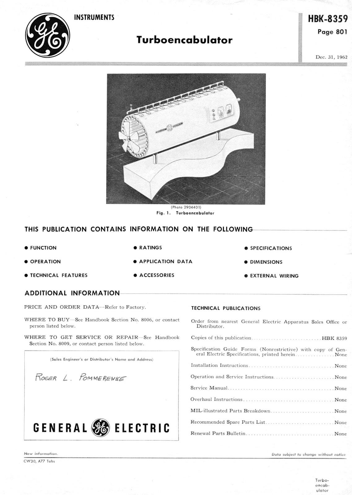
And its specs are something special:
See this promotional video of the turboencabulator (also known as retro encabulator in some circles) from Rockwell Automation, a competitor of GE in the high-growth, data-driven, highly disruptive turboencabulator market.
Here’s a transcript of this piece of comedy gold:
“Here at Rockwell Automation’s world headquarters, research has been proceeding to develop a line of automation products that establishes new standards for quality, technological leadership, and operating excellence. With customer success as our primary focus, work has been proceeding on the crudely conceived idea of an instrument that would not only provide inverse reactive current, for use in unilateral phase detractors, but would also be capable of automatically synchronizing cardinal grammeters. Such an instrument comprised of Dodge gears and bearings, Reliance Electric motors, Allen-Bradley controls, and all monitored by Rockwell Software is Rockwell Automation’s "Retro Encabulator".
Now, basically the only new principle involved is that instead of power being generated by the relative motion of conductors and fluxes, it’s produced by the modial interaction of magneto-reluctance and capacitive diractance. The original machine had a base plate of prefabulated amulite, surmounted by a malleable logarithmic casing in such a way that the two spurving bearings were in a direct line with the panametric fan.
The lineup consisted simply of six hydrocoptic marzel vanes, so fitted to the ambifacient lunar wane shaft that side-fumbling was effectively prevented. The main winding was of the normal lotus o-deltoid type placed in panendermic semi boloid slots of the stator, every seventh conductor being connected by a non-reversible tremie pipe to the differential girdle spring on the ‘up’ end of the grammeters. Moreover, whenever fluorescence score motion is required, it may also be employed in conjunction with a drawn reciprocation dingle arm to reduce sinusoidal depleneration.
The Retro Encabulator has now reached a high level of development, and it’s being successfully used in the operation of milford trunnions. It’s available soon; wherever Rockwell Automation products are sold.”
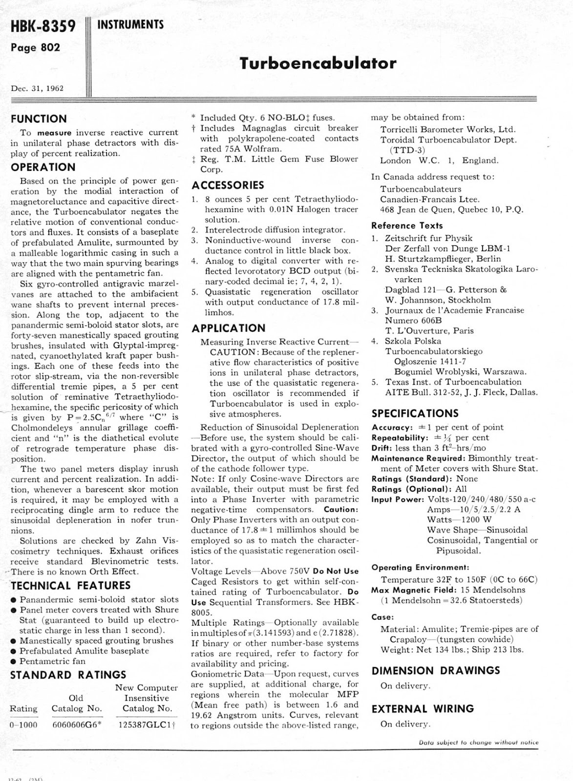
My autocorrector went nuts with that paragraph. Here’s a link to the original one which has an even more hilarious ending (hear the laughs at the end as the presenter holds the price tag with a priceless poker face.)
Reality has made the turboencabulator sound like a plausible product these days. The line between satire and “serious” marketing has thinned more than we should feel comfortable with. Technical content cannot succumb to market forces. Brochures cannot just become the vessels by means of which bullshit specs go around to attract careless customers. Because, at the end of the day, whatever you promise in your marketing material will need to live up to its promises, and that’s when the engineers are called in the game. And when things tend to get ugly. Our humble fight, from the deep trenches of the engineering departments, is to fight the urge of going full “turboencabulator” and actively police for consistent tech content to reach the marketing material.
In his short essay titled Politics and the English Language (1946), George Orwell argues that there is a trend to think poorly because the language is in decline; and, as the language declines, "foolish" thoughts become even easier, reinforcing the original cause:
A man may take to drink because he feels himself to be a failure, and then fail all the more completely because he drinks. It is rather the same thing that is happening to the English language. It becomes ugly and inaccurate because our thoughts are foolish, but the slovenliness of our language makes it easier to have foolish thoughts.
Basically: if you speak dumb language, your thinking becomes dumber which makes you spout even dumber language and so on. Orwell also discusses "pretentious diction" and "meaningless words". "Pretentious diction" is used to make biases look impartial and scientific, while "meaningless words" are used to stop the reader from seeing the point of the statement. According to Orwell: "In certain kinds of content, it is normal to come across long passages which are almost completely lacking in meaning."
But yes, everything in its right amount. Engineers can definitely overshoot this and turn marketing material into overly-specific, hard-to-swallow technical bulletins no one will get. So, fair enough, let the marketing departments do their job: they know—let’s hope—how to put things in a nice way so potential customers can feel curious about your products and to make the fear of missing out (FOMO) creep up on them.
Years ago, I was reviewing a proposal to be sent to a customer. As I was going through the pages, I remember feeling dizzy on the overall business babble. It was not only the buzzwords but also the childish aggrandizement, the cherry-picked metrics, the abuse of bold letters, the absurdity of the whole thing which —masochistically, again— I read from cover to cover. Of course, I had to say something—like, come on, are you serious? Long story short, not only the wording stayed, but this issue motivated a longer chat with the sales manager who said one of the most oddly flattering phrases has anyone said to me:
— Ignacio, if our sales material depended on you, we would sell absolutely nothing
Fair enough.
The Obscure Art of Making PowerPoint Slides
Everybody hates slides, and yet we almost daily find ourselves in front of PowerPoint, or any of its alternatives, having to come up with yet another presentation.
We all daydream during presentations. What we usually do is to visually “sample” the presentation while we are doing something else: checking emails, reading slack, writing to a friend on Whatsapp, whatever.
Some people are fond of making 80-slide presentations, as if the amount of slides would be an indicator of quality or proof of work. Not sure if I even need to say this, but hear me out: if a topic is properly, intimately, truly understood, anything you need to say can be said in 10 slides. Fight me. Yes, even if you are preparing a presentation about quantum electrodynamics (I just randomly picked a topic which sounds complicated, although there is nothing really complicated about quantum electrodynamics), you can say it in 10 slides, or less. And if, for whatever reason, you feel you must go beyond that, you have probably not structured the topic or meeting’s scope the right way; in short, you are suffering from scope creep. An infectious disease amongst engineers.
What I am saying is that it is better to partition a complex topic into smaller chunks, compared to going for a marathon of slides that people will just ignore or daydream on. Life is too short to write unremarkable slides no one will remember.
Conversely, think of powerpoint presentations as short stories, or movies. Because yes, making presentations is about storytelling. Storytelling means connecting ideas in a way they follow a narrative, stitching them in an attractive way. Storytelling augments reality by putting things together so they are more than the sum of their individual contributions. But good stories are brief. Time is king. Everyone is busy. Here’s some ugly news: nobody wants to read your stuff. That’s a fact. So, you better come up with a great story. You need to capture attention, and you have to do it fast. Attention is the real asset these days. So, better think of a solid story that will make them stop staring at their phones and feel they must look at your slides, or read your document. Your material must bring them to the edge of their chairs. Nice colors, logos and fonts help, sure. But the story is what matters. It has to be quick, clear, compact, and it must be awesome.
But how do you do that? How do you tell a story? Well, just like Steven Pressfield says in Nobody Wants to Read Your Shit1: like movies do:
Build the tension, and then pay it all off. That’s how jokes are told: setup, progression, punch line. That’s how any story is told. Have you ever tried to seduce someone? The hook, the build, the payoff. Theater works in three acts, Shakespeare as well. Do you know something they don’t?
So, how to structure a presentation to make it compact as a short story?
Agenda: It doesn’t hurt, and the bullets can act as waypoints to connect the beginning with the end. Here’s a bit of an obvious tip: keep it short. No one really wants to see a 25-bullet agenda. The right amount? 7 plus-minus 2. Another tip: don’t be afraid of being a bit spectacular on how you write those bullets. Nobody wants to read something like:
Requirements Review
Requirements Quality Assurance Process
Requirements Definition Methodology
That’s a yawn-provoking agenda right there. I would run in the opposite direction. Consider converting those bullets above into something like:
Quick Recap On Top Requirements
Is Quality ‘Free’ As They Say?
Let’s agree the way we will work
Or something like that.
Continue with something along the lines of the “previously on…” segment in TV series. Just like TV helps you recap what happened in the last episode or season, you must do the same with your audience. You may believe everybody is on top of the topic you are bringing up, but why would they? Are you so special? Everybody has a lot of stuff going on, so they might very well have forgotten what the whole thing was about. So, take one slide to set the context: what brought everybody here in the first place? What are the main issues to solve? What are the things everybody must remember before gearing up? Always kick off with proper introductory material, including the unavoidable basics—the things that must be understood if anyone pretends to get anywhere with what is coming next in the material. Imagine Walt Disney being randomly unfrozen2 and the first thing he does is to read your material: how do you start?
Build the tension: Now that everybody has been brought up to speed, start showing some substance. Point out the problems here. The conundrums.
And now, time to punch them in the face: transient is over, this is when the most important, the uncomfortable truths must be delivered. If there is an itchy point, don’t go too much around it out of politeness. Be clear, and direct.
Avoid links to external pages during the presentation. Avoid videos which create uncomfortable gaps in the presentation flow. Flow is essential, with flow understood as the smooth time evolution of the presentation. No interruptions, no long pauses, no stupid questions to the audience that no one wants to pick up.
Conclude, but don’t just summon Capt. Obvious: a conclusion slide only to repeat what you said some slides ago is utterly stupid. Conclude things that are truly conclusions. Take the time to process what you said and pack it in a digestible way. Say about next steps. Be receptive here on people raising eyebrows, this is the time for a good discussion and for reading body language.
Trash the “Any questions?” slide, with that annoying stock picture of the little figure with a giant floating question mark above his head. If your presentation was clear and provided good food for thought, those questions will naturally come anyway. If it was a yawning factory, your little guy with the question mark will not really raise the dead.
Incredible to state this, but always number your slides! People can easily remember a slide number and ask you to go back if needed. As opposed to the annoying “please go two slides back, no, no that one, one more, no, three more back”. Agh.
Now, a few bonus considerations:
Always prioritize content before format. Have you ever read a presentation or a white paper from any of the so-called Big Three? Superb design. Great shadows of color. Stunning fonts. Everything looks so polished, so in place. Yet, the content is frequently utter bullshit. Pure hyped, MBA-originated fantasmagoria. The best presentations I remember had no template. Just white background, with black Arial letters. Granted, this could be a tad too rough for the eye, and some better visuals do not hurt, but the visuals should never come before the content.
You can be funny, but not too funny: the world is already full of great comedians. And humor is definitely a good way of breaking the ice. But adding one Dilbert joke per slide is just annoying. That’s what separates comedians from us mortals: comedians learn to read the room and can adapt their jokes as they go3. Too many jokes are distracting, and while you might get a gentle expelling of air through someone’s nostrils for the first joke, you will only get cringe and silence after the second or third comic. If anything, and if humor is an unstoppable force inside you, Mr. Funny Guy, use your spontaneity and make those jokes verbally as you present.
Present your own shit. If you didn’t make the slides yourself, everyone will notice after 30 seconds of presenting. Presentations are one of those things you just cannot delegate, unless you are a General Partner in some big consulting company, in which case it doesn’t make any difference because the presentation is probably pointless anyway. But tech presentations, that you simply do not delegate.
Go through your slides at the proper time. If you prepared the slides 4 months ago, you most likely will not remember what you put there, in which case you are in the same situation as the bullet above. Nothing as uncomfortable as someone having to take precious time to read a slide before presenting. A perfect flow breaker.
If for whatever reason you cannot present (your laptop was eaten by your dog, or similar), postpone until you get your setup right. Do not use someone as your slave to scroll slides for you. Slavery is illegal. It gives a horrible feeling of carelessness, and the poor person having to click slides back and forth does not deserve the pain.
Graphical Depictions
There’s a big, big problem in engineering which has remained unsolved for centuries: a depiction of two boxes connected by a two-sided arrow can mean anything. Literally anything. Depending on the context, it might be depicting two computers connected by a cable, two submarines torpedoing each other, or two charged particles repelling each other. Block diagramming is a no man’s land, and a largely unregulated practice. Let’s stop acting like it’s not. The thing is, it will continue being a total anarchy as long as we are given the immense freedom to choose to graphically describe things as we please. Which is a blessing and a curse. Perhaps more the latter than the former. I dream of the day I will organize the first-ever World Congress on Block Diagrams and I will open the ceremony with a speech I’ve been practicing for years:
— Hello. Your arrows mean nothing. Thanks.
The long-time-underestimated thing in graphical depictions is semantics. Semantics means what you understand from what you’re looking at. When you see a traffic sign which is, technically speaking, just a funnily drawn, colored flat surface, what the sign means—its semantics—is unmistakable. A ‘No Parking’ sign means what it means, and there is no room for other interpretations. You know what happens if you leave your car in an area next to a sign of that kind, because you know what that sign means and its implications of not following the rules it means.
Well, engineering diagrams are like traffic signs whose interpretation is open. The creator of said diagrams has a natural tendency to believe that everybody understands the semantics behind it—a semantics which only lives in his or her head—but reality might be a tad different.
So, it might be a good time to bring back a postulate of diagrams which I already presented in a book I wrote a while ago:
Block diagrams are only fully understood by those who drew them. Corollary: there are as many interpretations of a block diagram as people in the audience.
Conveying information in graphical ways is really powerful as it is tricky. An image can speak a thousand words, they say. But what if it can speak the wrong thousand words? Those are a lot of words.
And this is not something graphic designers can really help with: a shitty block diagram is a shitty block diagram regardless how nice it looks, how many shades you add to it or how 3D-looking the boxes are. Drawing good block diagrams is a semantic challenge, not a visual one. See below some examples of real-life semantically broken diagrams provided by the equally semantically broken defense industry:
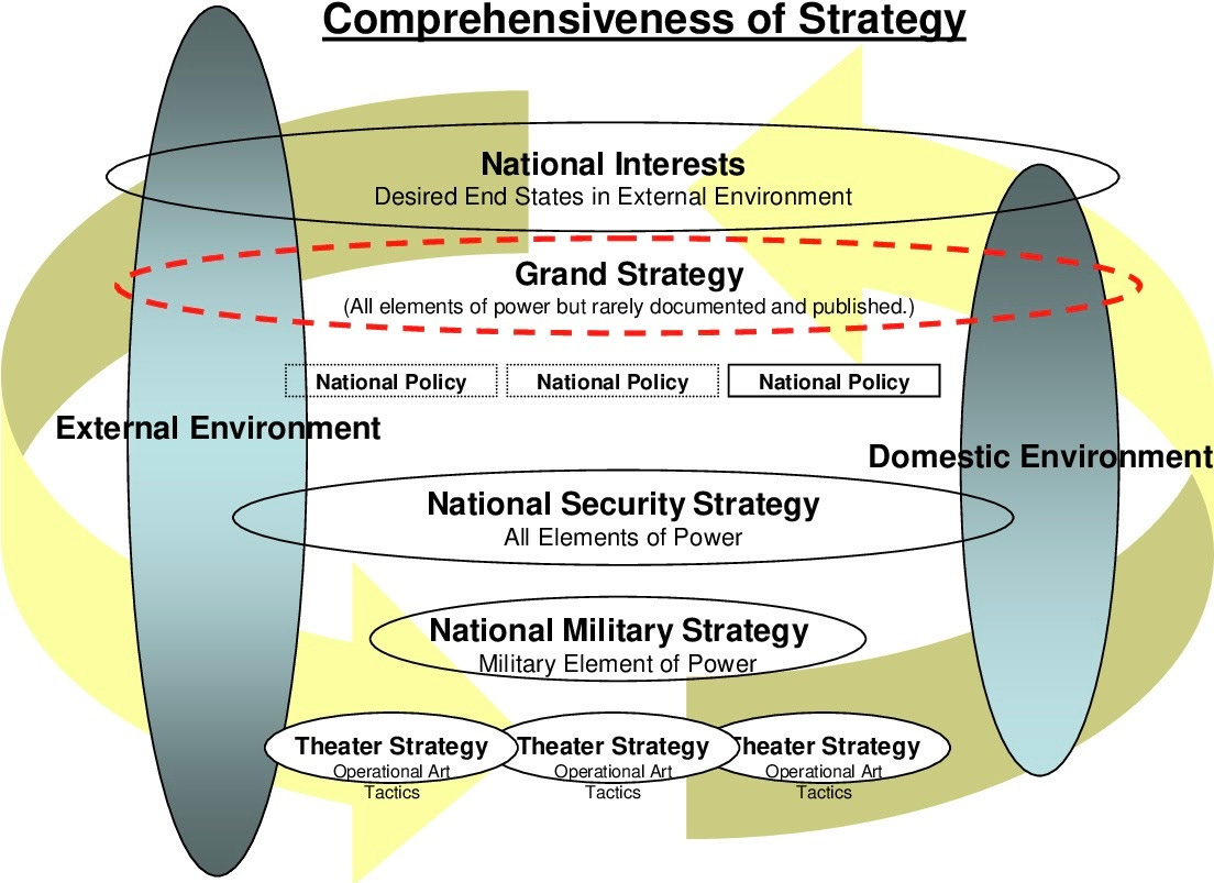
But, now a message of hope. In fact, it is absolutely possible to define solid rules for graphical diagrams. Electrical engineers, for instance, have devised very precise symbols and ways of graphically depicting circuits. These are called schematic diagrams, and there is a very rich set of symbols that EEs use to describe their designs. Tools, both commercial or open-source, have large libraries of these symbols inside which makes it very simple for an engineer to lay things out. Then, a schematic diagram made by subject A is understandable by subject B. Of course you can draw bad schematic diagrams, but at least the symbology is consistent.
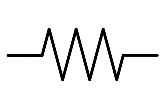
Form Follows Function? Not really
I stop for a moment to digress a bit and talk about the physical resemblance of graphical depictions. For example, Electrical Engineers’ standard symbol to depict a resistor looks like this:
But actual resistors, if you go and buy them in a store, look like this:
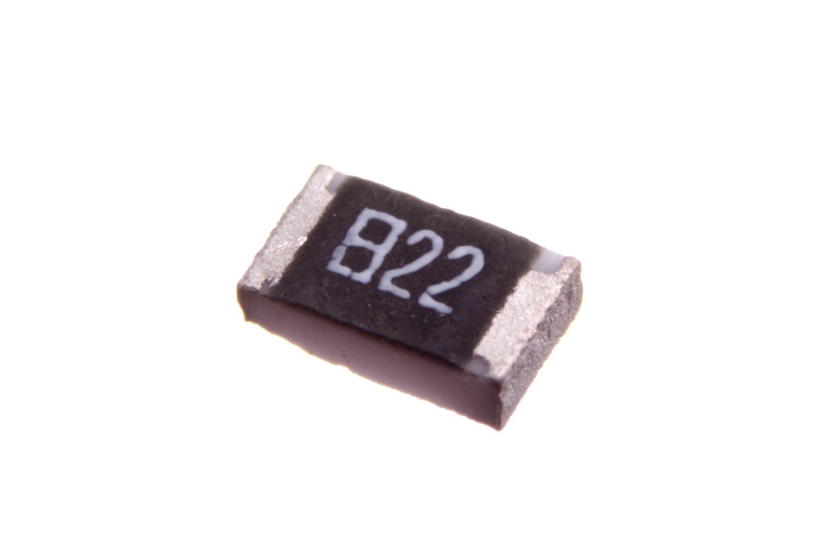

As you can see, there is no correlation, visually speaking, between the symbol that *means* resistor and the way real resistors look like. The reason for this is stupidly simple: they do not need to relate as long as it is clear for everybody that the symbol shown above means what it means.
Now when it comes to depicting the architecture of a more complex system, say, a satellite, aircraft, drone, whatever, we must start depicting “boxes that contain other boxes that contain other boxes”. Things can get more abstract, and there are no unmistakable symbols anymore because those boxes become very unique in their nature, so everything of that kind naturally becomes a generic “box” with a name in it. And that’s when the interesting stuff begins.
Software industry did a funny thing, though. They became jealous of the rock-solid symbology the Electrical Engineers came up with and decided to create their own. Or kind of. So, the Unified Modeling Language (or UML) was born. As a side note: in general, anything called “Unified” tends to be a huge warning sign. The adjective unified tends to describe an effort to consolidate disparate, disorganized and even contradictory things together. Most of the things called “unified” tend transpire as eccentric cocktails of sorts, and UML is no exception. But I will try to be objective here and just describe what it is.
UML came to create a way of modeling software in a graphical manner. So it defined a set of diagrams, with their rules and semantics. Which is a noble thing to do, except for the fact that software engineers were very lax in respecting said semantics.
Years ago, I had the (bad) luck of attending a course on UML for embedded systems. Course started ok, but suddenly, the instructors started to mix up diagrams together, for example adding a finite state machines inside a sequence diagram and connecting them together. The travesty. I remember pointing this out and even getting a bit salty about it. The absolute whole point of getting consistent semantics in diagrams is about being strict on it. If we are not strict, then it just becomes a regular block diagram where all the postulates I listed above apply.
And, last but not least in this dissection of block diagramming, another uncomfortable truth:
A block diagram is obsolete as soon as it is released
The most painful part of drawing block diagrams is not about getting the arrows straight and aligned—why no tool has solved this issue yet??—but to keep them up to date. Here’s how the mechanics usually goes:
Spend hours drawing a block diagram
Paste it as an image in a document
Release document (some old fashioned people will print it in paper)
Something changes, block diagram goes outdated
Cringe in a corner because now there are multiple copies printed of your document with a block diagram which is no longer applicable, and accept that you have become an involuntary soldier of the disinformation wars.
Is there any hope? Yes, there is.
Draw Better Diagrams With These Simple Tricks (Doctors Hate Him)
Assume no one will understand what you are drawing, because they will genuinely not
Do not try to resemble physical form in a block diagram. There is probably a better tool for doing that (CAD, EDA, etc). Add screenshots or exports from those tools in case you must show how something physically looks like. Uncomfortable truth: Visio is not Autocad. If you still want to depict something (for example you want to depict a computer as a physical computer and not as a square box if for instance you are drawing a network diagram), use standard icons and images from the libraries. Do not draw a computer out of square boxes and circles.
Your arrows mean nothing unless you clearly specify what they are supposed to mean. Arrows imply there is a link between two entities. Specify what that link means. Is it matter? Energy? Power? A torpedo? We can never know unless you enlighten us.
Try to avoid obscure color codings, unless you make the coding very explicit. If you thought that painting some boxes green to make a difference from some other boxes shared in pastel red would improve the diagram, think again. You might have just added fuel to the fire.
Never, ever, under any circumstance, think of using spreadsheets to draw diagrams (yes, that’s a thing)
Keep an eye out on the diagrams you have released into the wild and at least make some effort to keep them updated. Granted, if you drew hundreds of those, you will not be able to babysit each one of them anymore. In that case, hope for the best, but if you catch one, try to quickly say to the right audience that the diagram is out to date.
Have some minimum standardization of diagramming tools across your organization.
Make sure you have the original file of most diagrams out there. Nothing like a popular block diagram whose source file is gone forever and you only have a crappy JPG to live by and pass around.
Writing Does Not Bite
Inspector Closeau (in a thick french accent): does your dog bite?
Hotel receptionist: (brief pause) No
Inspector Closeau leans to pet dog, who reacts aggressively, biting his hand
Inspector Closeau (in distress): I thought you said your dog does not bite!
Hotel receptionist: That is not my dog
Unlike that ferocious, albeit small dog from the classic The Pink Panther Strikes Again, writing does not bite. There is nothing really dangerous about venturing yourself into the act of putting ideas together in written format. What is more, writing technical content is a noble task because it will most likely compound in time by helping people gain more insight about a topic of importance. Could be a colleague, a customer, a supervisor, or an investor. The act of absorbing and distilling information into knowledge can be a totally different experience depending on the quality of the content being consumed. If concise, accurate and entertaining, riding a learning curve can be, in fact, enjoyable. It is reassuring to consume content in which you can perceive has solid thinking behind it. It does speed up the whole process, because time just flies when you enjoy reading, as you go less and less ignorant by every paragraph, by every page.
This crosscuts every scenario where knowledge and learners (of disparate avidity and quantity) mingle together:
Courses or lectures
Internal presentations to your colleagues to convey a new idea or project
Material for newcomers wanting to learn about technology or the products the company they have just joined makes, or the ethos of the organization, its culture, etc
Talking to investors for fundraising
Mentoring
Content marketing: creating technical material for potential customers to understand complex products or technologies
Documentation (internal or external): manuals, handbooks, cheatsheets, datasheets, white papers
One time, I constructively criticized a document from a former colleague from the IT department. Said document was a HOWTO guide about network usage which had an unforgivable flaw, at least to me: broken links. In time—and after some initial saltiness from the author upon my remarks—the document became a recurring joke between us. At some point, we decided to put an end to the amicable feud by uploading the doc to a satellite filesystem and sending it to space. Yes, this actually happened. So next time you look up to the sky, mind that a poorly written tech document full of dead links—all links are dead in space—could be flying over your head. Not all documents enjoy such a sophisticated destination. From all the documents I have constructively criticized, this is the one that I will always remember, for obvious reasons.
Dig It
Captain Obvious strikes again: you must deeply understand the topic you’re writing about. “Write what you know” is an evergreen, solid piece of advice someone said a while ago.
Do not wing it.
Be it a manual, a presentation, a proposal, or an email, there is a condition sine qua non for good tech content: you have to dig the topic you are trying to explain. No embellished writing, no fancy choice of words nor superb illustrations will sugar coat a poor grasp of the underlying topic. If too far over your head, go to the basics, start slow, re read as many times as needed. Embed yourself in the whole thing. Read a book, or two if necessary. But read good books; check reviews. Or if you know someone who digs the topic, go find them and ask them to transfer the knowledge, or even better, ask them to contribute to the material if possible.
Learn To Shut The F*** Up
I said before, write more. But I also say: write less, way less.
Allow me to explain.
There are millions of books that cannot even remotely justify their 300-something pages. Filler, filler everywhere. Most non-fiction books out there should have been an article, or a tweet. Here’s a summary of every inflated non-fiction book ever written since the dawn of times, for your convenience:
They will use the “known-knowns, known-unknowns, unknown-unknowns” platitude, and add 100,000 more random words around it
They will make an observational point with weak research evidence, and then make the same point again for 250 more pages
They will propose a new mental framework. It will be some platitude describing just common sense and they call it a framework. They will equip the framework with a vacuous cartesian graph.
They will cite themselves (Chechile, 2023)
They will re-interpret Nokia’s downfall in their own convenience just to illustrate what can happen to you if you do not apply their mental framework
They will consistently fall into the fallacy bias: finding fallacies when there are none, and the bias fallacy: to call everything a bias when it’s not. Italics will be paramount.
They will eventually land an article in Harvard Business Review for marketing purposes
They will update their Twitter bio—if they are still alive—to include “bestselling author”
Fellow authors of the same quality will recommend the book as “a brilliant, caustic take on management science. The best since Peter Drucker”.
Profit. Rinse and repeat.
So, next time you spend your money on shitty management books, try to refer to the list above and see how many boxes they check.
The global library is full of books filled with white noise. And here’s a commandment:
thou shall not overdose your audience with information
When it comes to transmitting signals over a physical medium, there are technical means to take care of the famous signal-to-noise ratio. These technical artifacts (power amplifiers, filters, etc) work for us even if we are not looking.
But when it comes to transmitting our own ideas and concepts to an audience, either by a presentation, dissertation, documents or emails, we are responsible for choosing the SNR ourselves, having access to both numerator and denominator of the equation. No automatic artifacts are possible there, we’re on our own. You would imagine we naturally seek to maximize SNR. But we easily tend to do the opposite. We say too much. We’re chatterboxes. We love the addictive filler, the sound of our voices and the look of our phrases. We state the same things over and over. I’m doing it now.
Word count and meaning have a strange relationship. Clarity and brevity are close siblings, but not twins. The sweet spot is when you can marry both: being brief and crystal clear. When I come across such a combo, damn it feels great. It’s so rare.
Get rid of filler. Remove. Cut. Erase. Discard. Drop. Form strategic alliances between words, do not just pile them up. Say less. Don’t make a point that has already been made.
Disambiguation and Acronyms
Recently, I had to read a technical manual about the 5G mobile communication technology. How did I tackle it? I got myself an almost intractable 600-page book. Let me tell you, 5G is an absolute miracle not because of the complexity of its technology (which is not negligible) but because of the huge consensus needed to come up with such an impactful tech stack to be fielded globally. But, oh my, the amount of acronyms in that book was mesmerizing. In all fairness, it is not the authors’ fault, but the folks behind 5G design and standardization. Ah, so you wanted to see the acronyms, eh? I knew you would ask. So, find them here.
Yikes. And I thought space was the industry of acronyms. I bet you have clicked the link and carefully read those one by one. Oh, you didn’t? I am disappointed. By the way, I took the liberty to add an extra acronym somewhere there for comedic purposes, so go and find it.
The book was practically impossible because, with so many acronyms, it was overly difficult to read and try to understand the topic while having to go back to the list of acronyms (which was also not hyperlinked) so then I had to memorize what page I was, go to the table, see the acronym, and go back, only to repeat this process like 50 times per page. What is more, the list above is especially tricky because it has nested acronyms! For example see where it says SU-MIMO: it means it is not enough to go and search for one acronym in particular, but you need to then jump to find what the MIMO part of the acronym inside the acronym means. You can suffer a genuine mental stack overflow. Avoid at all costs something like this, think of your poor readers struggling to stay afloat. On a positive note, most likely the technology you are dealing with is less complex than 5G. If not, I pray for your soul.
Tone
Content can really use a colloquial tone (except when strictly required otherwise). Unless you are writing for Her Majesty The Queen (Edit: King), choose a tone which reflects closeness and not distance or coldness. Avoid consistently trying to make the reader aware of your erudition. If you are truly smart, you probably do not need to broadcast it to the four winds. When I write, I tend to use a conversational tone and this helps me to bring the hypothetical reader closer to me, as if it was a chat more than a lecture. Let the lawyers talk like lawyers.
Typos
Seeing typos in written content is almost insulting for the audience these days. With the myriad of AI-powered auto correction tools, text suggestions and auto complete, plus the supply of multiple reliable dictionaries online, a typo gives a strong message of laziness and lack of detail orientation which can be offensive.
Don’t Be Ashamed Of Reusing Your Content
Eventually, the content you create starts connecting to itself. At some point, you will be able to point your current content to your previous content to augment a point of view, or to elaborate better on a topic. The beauty of content creation is that, at any rate, content starts supporting itself and creates a flywheel effect of sorts. But beware: this does not mean mindless copypasta, which nicely prepares the floor for the next section.
The Eternal Sunshine of the Mindlessly Written Document
We’ve all been there. Sitting in front of the screen, about to start writing a boring-ass document. Writing can be fun, but there’s not much fun in having to write something titled “Software Development Plan Specification” or “Work Package Definition Procedure”.
In some industries, documents are the principal produce of projects. There is a big amount of industries worldwide which are shamelessly document-centric. In these, documents are milestones, main deliverables and principal subjects of reviews and encumbered meetings. Entire teams fly around the world to gather around a table to discuss a document which is probably 90% copypasta from some other similar document.
As boring-ass documents proliferate, content loses the center stage and format gains attention. Inverse to what common sense would indicate. Document reviewers start to look more to formatting issues than the content itself. Are the applicable documents correct? Did this person code the document properly? Is the table of contents following the recommended style? At this stage, a document with lorem ipsum would perfectly make its way through the system.
In document-centric environments, there are sophisticated document-signing systems which circulate documents around for reviewers and approvers to be able to see the documents and approve them and sign them, or reject them. Complex projects can produce hundreds of documents per month, and the strongly hierarchical orientation of these organizations make it possible for a situation like this to appear: one single person—usually the project’s Chief Systems Engineer or similar—being the last single approver of every piece written. It is hard to imagine anything different than this for that poor soul:
So, yes, bureaucracy is a thing, but I am not talking about bureaucracy here. What I am talking about is the disregard for accurate, proper, up to date content, in favor of mindless copypasta put in place only to check boxes or to comply with the reigning status quo. In a company I was working for, there was a set of famous block diagrams which were copied and pasted across a myriad of different documents, even in documents from projects in which the block diagrams were inapplicable because the architecture was different. Still, those block diagrams would be sitting there, and the review chain would be unable to spot the nonsense of having those time and again.
Some of these mindlessly written documents are expected to reach X or Y amount of pages to make them “credible” or “good”. On one occasion, I was in charge of writing a software user manual for a customer. So, one day I was called for a meeting with a higher-up from my company, who was very interested in knowing the status of this manual because its delivery would unlock a big payment from said customer. In the meeting, this higher-up was definitely not interested about the outline of the doc, or about the content. He asked me straight away: “how many pages do you have?”. So I said, “80”. He frowned a bit, and said “can you make it 115?”. “I guess I can”. And off I went to inflate the manual with the right dose of filler in order to achieve the new page goal. Up to this day I wonder why he said such a precise number. 115. Not a 100 or 120, but 115. Anyway, 115 pages were delivered, the customer was happy, and the money was paid. I am sure no one ever read that document.
A sad reality is that a very big portion of these robotically written documents are seldom read. So, why do we keep on writing them? To keep manners? When will someone finally point out to the emperor’s clothes and say that it makes no sense to spend energy—mental and electrical—to create documents that no one gives a damn about? More importantly: is there an alternative to the document-centric approach? Well, the solution appears, preliminarily, as worse than the problem. Some claim we are leaning towards a Model Based era where you would be able to create a model that automatically creates documents. In this way, if you alter the model (because the system has changed its design, or similar) then all documents are automatically updated and exported. Sounds great, but so far, this is mostly pure fantasmagoria. For starters, no one seems to have a solid understanding of what a model really is.
RTFM
This section is dedicated to my long-time friend Z.S, whom I once somewhat rudely sent to RTFM thinking that she was aware of the acronym. By the way, it stands for “Read The Fucking Manual”
Say you are tasked with the ginormous challenge of documenting something complex. For example, you are assigned the task of writing a user manual for a big, overengineered piece of software. From the outset, it sounds like a titanic task. Where to start? How to proceed? Well, in a way, it is no different than writing a book. Now, let me tell you a short story about how painful it is to publish a book through an ‘established’ publishing house now4.
Let’s assume you are not J.K Rowling but a John Doe, just like me. So, in general, John Does need to attract book editors, so they are requested to submit book proposals. What are book proposals? They are painfully tedious forms where you need to describe things such as the candidate market of your book, its direct competitors, its potential sales volume, how many color or black and white figures you plan to add, and how many footnotes. And the list goes on and on. Then, you must add an outline, some drafts of chapters, the table of contents, and the like. If you pass the first selection criteria—which tends to be hard—then the person handling your proposal will summon a sort of “board of reviewers” composed of some respected people in your field who will go through your proposal and judge it. Mind you, all this can take several months, even years. And then, after an excruciating long process, the proposal might be, of course, rejected. Shit happens. If the proposal is approved, you still need to write like 70,000 words in a fairly short time, manage hundreds of figures, tables, collect permissions, watch copyrights, and whatnot. And all for peanuts or no money at all, because again you are a nobody so the contracts for nobodies can be unfair.
But hey, this is the good news I wanted to convey, finally: you do not have to go through that pain with your manual. You are your own publishing house, you decide what to put, and how to put it, you own the process end-to-end. You get paid for it, and the reviewers are probably way nicer. So, in perspective, writing a user manual for a complex system is not so bad after all. You can relax and enjoy creating accurate yet entertaining technical material. But, how to proceed?
If you have to explain how to operate a complex thing, it is better to put yourself in the right shoes. You might have been a designer or developer of the thing you are now writing about, so you might be prohibitively contaminated by some vices and specifics of the process. You need to get rid of that and think from the customer or operator side. What do they need to know to operate that thing? What are the corner cases?
An outline should start materializing from the initial fog. Introduction, chapter 1, chapter 2, etc. A sequence of topics must appear, usually following some logical sequence of “from more basic to more advanced”. It is important to make sure you state clearly what readers will learn by diving into particular chapters. And, if possible, you should define the chapter logic as “self-contained” as possible. This means, readers should not feel lost if they jump one chapter here and there.
When writing manuals, it is great to define the outline and then grow the content as evenly as possible. This means, growing in some sort of balanced way the different chapters. It also helps to make the writing process a bit nicer: if you are tired of one section, go somewhere else, start fresh, and later you can come back. It makes little sense to finish a chapter to its fullest when the rest of the manual is still at zero. A manual is a system of sorts, it needs all its parts to mature together to show integrity.
One unsaid big drawback of writing is that you have to re-read what you write an unholy amount of times. When I wrote that book I wrote, at the end of the process I was absolutely sick of it. I still am. It can happen, but it still makes sense.
As a writer of manuals, the ultimate flattery is someone angrily sending someone else to read the fucking manual, when said manual is your work. Aim for that.
Closing Remarks
A long post. Sorry. I am aware of the contradiction of recommending brevity and good signal to noise ratio while still throwing a 9000-word article straight to your face. But believe me, a smart person would have turned this into a book and even made profit out of it. So it could have been worse.
The title of the post has the word “esoteric” because communicating tech seems a bit obscure. But as most esoteric things out there, they have plausible explanations. Communicating tech is nothing esoteric. It is doable, it can be enjoyable, and your readers will be more than thankful you took the time and effort.
https://www.goodreads.com/en/book/show/30556551
Note that the myth of Walt Disney’s body being frozen has been debunked multiple times.
‘Before & Laughter” from Jimmy Carr is a great book about how comedians think and work
As opposed to what is called “vanity publishing” in which you basically pay to get your book published. A method chosen by many authors on management…