
What Makes Bad Design Bad
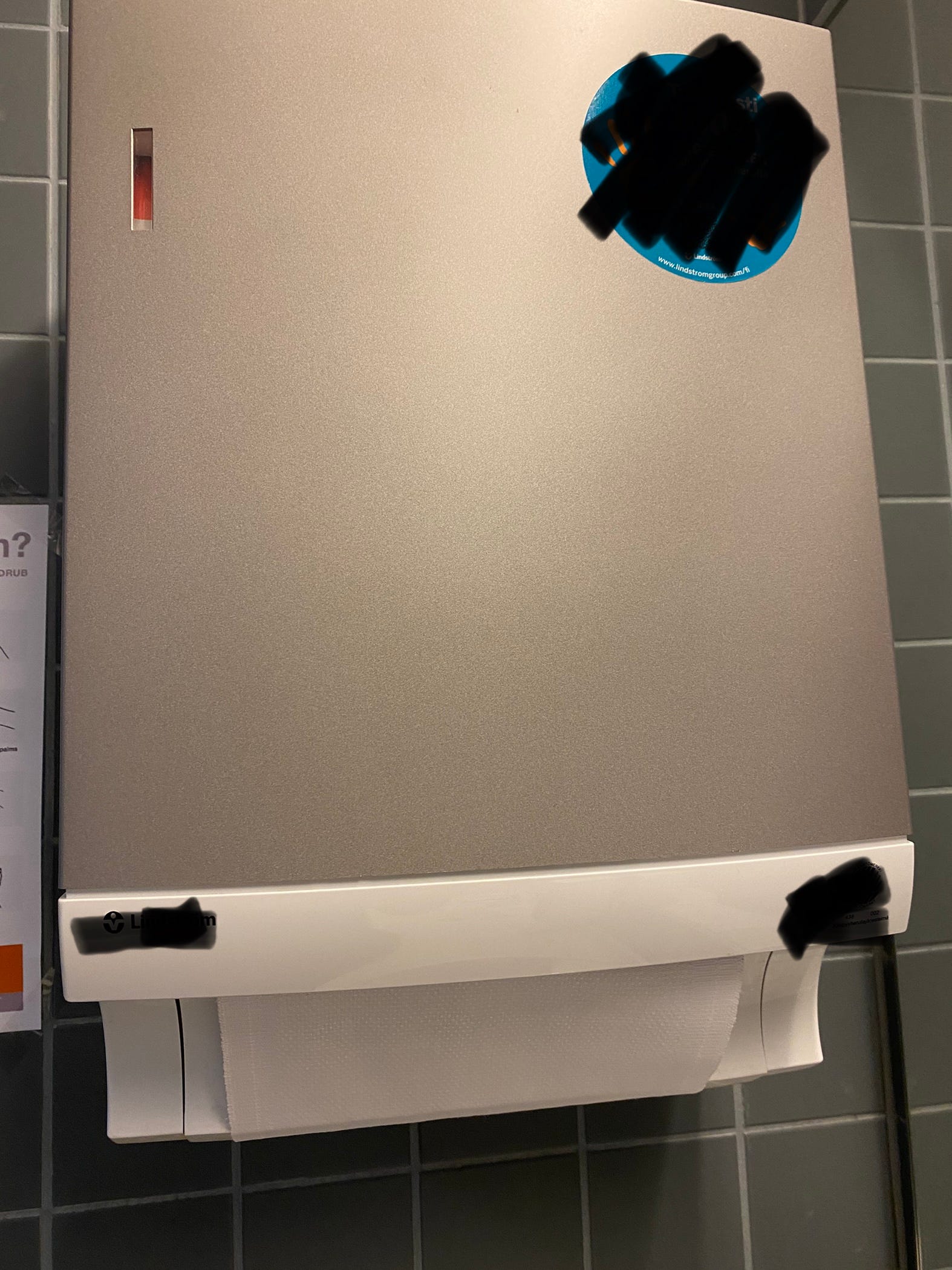
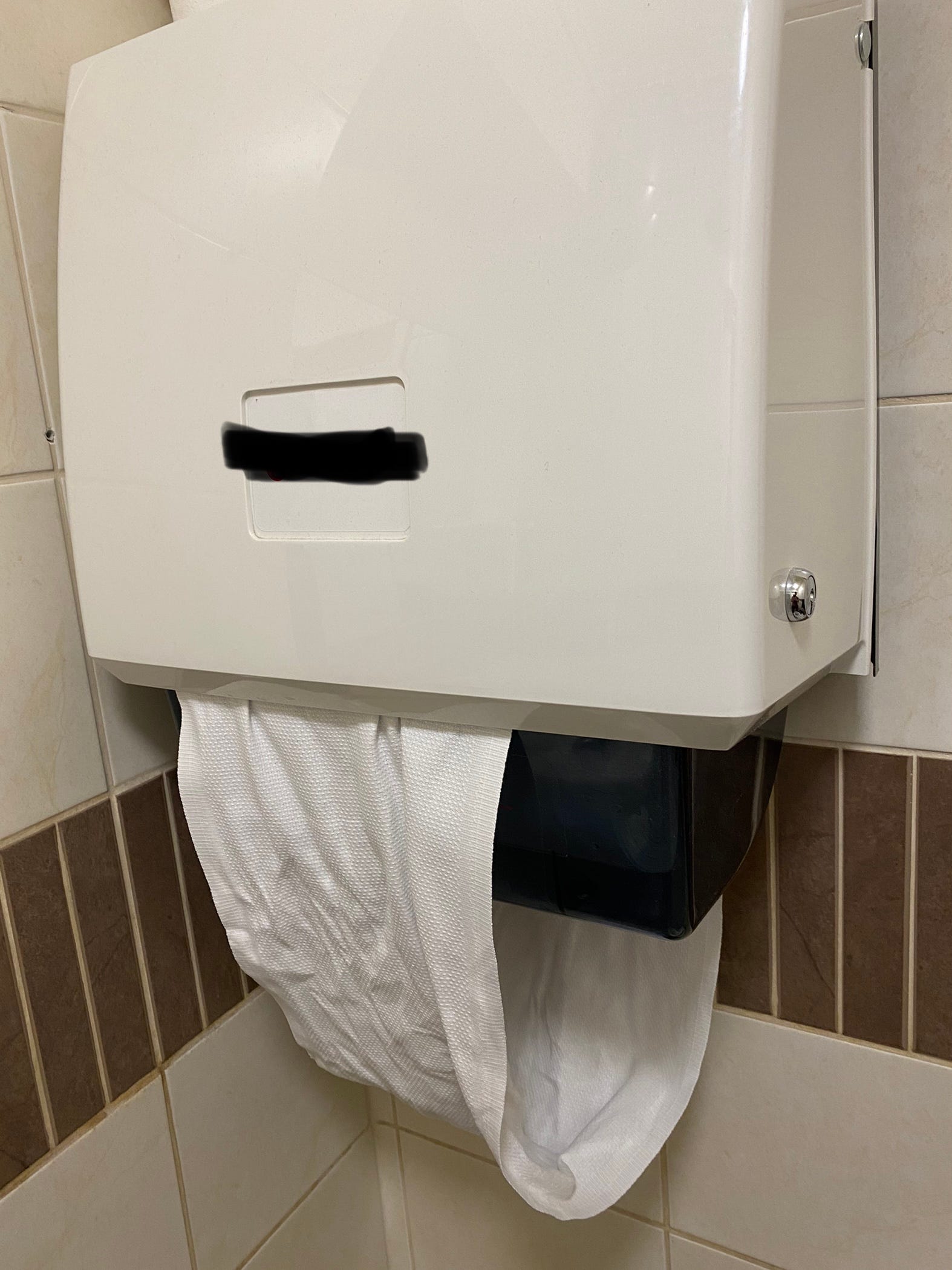
Restrooms are like cathedrals of bad design. First of all, there is absolutely no standardization around toilets: soap delivery systems change like the weather. In one WC, you have to push a lever, in some other one you must wave your hands like you’re Marcel Marceau. In Rome, for instance, you may have to step on some pedal to get soap (I thought all roman toilets were soap-dry until I embarrassingly realized this). Hand drying as well: paper towels from under, from above, air blow, air curtains. And what to say about that overly questionable rolling cloth concept that always gets stuck and uncomfortably wet? How come that thing ever passed a design review?
And to wrap up my introductory and random rant on toilets as emporiums of half-witted design, one of the most annoying designs ever, the mysterious metallic toilet paper dispenser box:
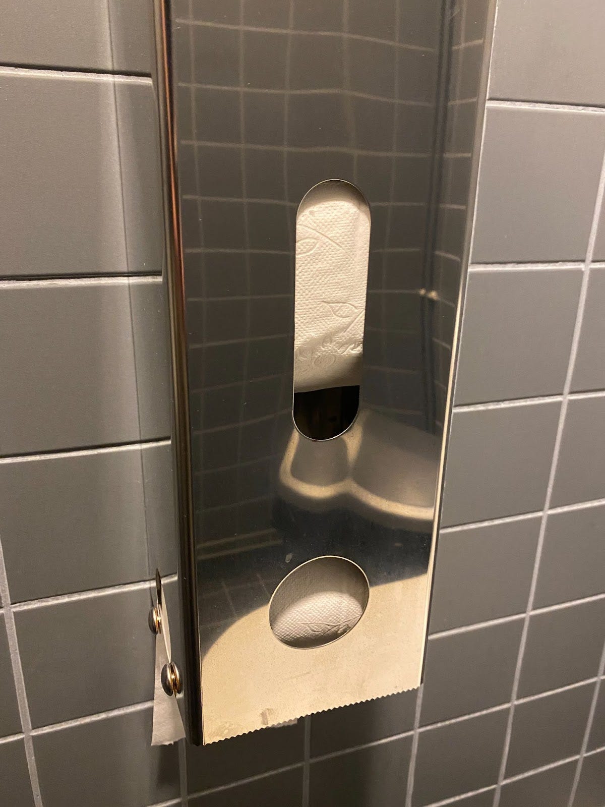
What kind of cretin designed this thing? Supposedly made to host several rolls of paper to delay replenishment, all it accomplishes is to get the paper rolls stuck together and pressed with each other so you can’t get any paper out, let alone trying to open the thing to fix it. Awful design.
What makes bad design bad?
I will quickly leave any aesthetic matters out of the discussion. I am not referring to how “beautiful” or “ugly” an object can be—this might be a bit too subjective—but more about how well the object accomplishes its intended function. Mind the word well needs some unpacking. Accomplishing a function well includes:
Being intuitive: it is possible to figure out how it works with objective information provided in a non-judgemental way. Or just by looking at it if the thing is simple enough. Which paves the way to the next one.
Being simple: to operate it requires a small amount of steps and configurations.
Being self-contained: to enjoy it you only need that object and nothing else.
Being reliable: the object functions without faults or unwanted interruptions for an stipulated period of time
All that results in the object performing without friction. A lower-friction design ensures the object can harmoniously be part of a larger design and contribute to the intuitiveness, simplicity, self-containedness and reliability of its parent object. System-level harmony seldom comes from using a magic wand at the end of the system integration but thanks to the individual contribution of low-friction objects that compose such system.
It is important to observe how the aspects of ‘good design’ listed above are cross-coupled. With higher simplicity we increase the probability of intuitiveness—it’s harder to make things intuitive as they get more complex. With more self-contained designs, we increase simplicity because we reduce dependencies therefore reducing the number of steps to operate it. With simpler designs we decrease the probability of malfunction due to smaller combinatorial paths to failure.
An important factor to point out is how these aspects are independent of scale. It does not matter if we are talking about a microscopic system-on-chip, a toilet dispenser or a 560,000 kg large wide-body airliner. These things might be well designed, or not1.
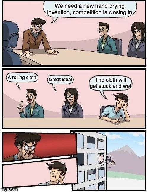
Bad design is puzzling because almost no artificial object produced out there depends on one single designer. Bad designs typically go through reviews and the scrutiny of several—I want to believe—judicious people. I like to imagine the design review of the rolling hand cloth concept criticized above:
It does take some skill and teamwork to design really, really bad things. Ill-designed objects usually:
Take for granted we know things about them we don’t know.
Take for granted the operators have skills they may not have.
Leave critical aspects of operation up for the occasional operator’s interpretation or good/bad judgment.
Work due to ‘accidental reliability’: no one knows how long they’ll work and it’s a remarkable miracle they did in the first place.
Invalidate the main function they are supposed to fulfill: for instance, a toilet towel that leaves your hands dirtier than before using it (sorry, last time, promise).
Recently, I had to change the wiper blades in my car. Blades easily—easily!—check out practically all the boxes of terrible design. Let’s see:
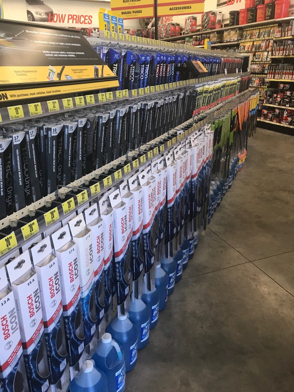
There are perhaps as many blade types as car models are out there. What is more, it also depends on the the year—and month!!—the car was made to ensure a blade model works.
Blade packaging has the supported car models on their back, which means you need to take them out from the hook at the store to see. There are hundreds of types in a store (see photo below), which means you need to go one by one. Finding the right one feels like winning the lottery.
The instructions in the packaging include miniature, overly pixelated photos and repeated references on how easy everything will “click”. Here’s some news: it does not easily click.
Cars have a “marketing” model name (for instance, BMW 320i) but also factory names (BMW calls the 320i, for some reason, E90). Blades may refer to one naming scheme or the other, depending on where the wind blows.
In conclusion; luckily, we are surrounded by a majority of well-designed things we don’t pay attention to, principally because they just work so we can carry on with our lives. Badly designed things annoyingly get our attention when we should be minding something else. Every now and then, weird designs can give us a chuckle or two.
The V-22 Osprey is also living proof of designs that lie in between definite types. It is not a helicopter, nor it is an aircraft. You may believe you get the best combination of both, when in reality you get something that underperforms both as helicopter and aircraft.